Saturday, August 30, 2014

SUBJECT TREATMENTS AND APPROACHES 4


https://blogger.googleusercontent.com/img/b/R29vZ2xl/AVvXsEiGmr1R0Cppzkpus8pQoFSWH_VhLBqfCafgz2hJE7fByL8lBzOljkUXm__e8ANNgUoLxAwcTE6ai9Dh1B_A3WuIls_iEvCJxiBfnDAHAIoWCnTs-C0Aa5EbaD7m4SqSgAMiQ3P7m5vc3QA/s1600/WS+Diamonds+and+Dustwebsz+.jpg
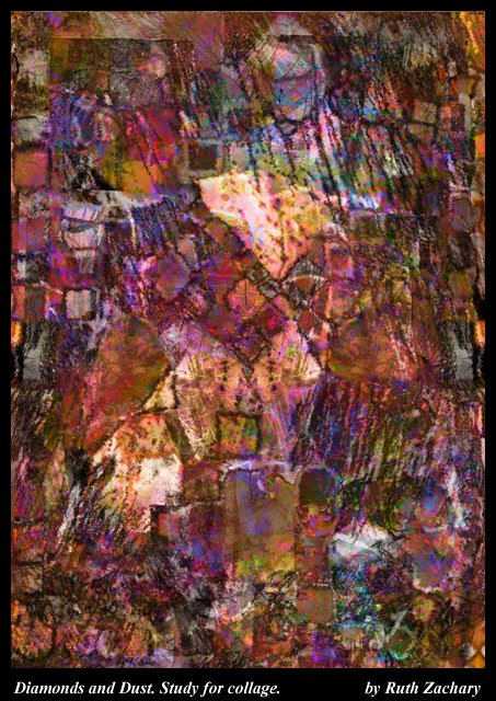
Diamonds and Dust, Unfinished. Diagonal Emphasis


Organic with Geometric Elements and Linear Textures.
The image above also contains both organic and geometric shapes with a diagonal emphasis Diagonals often suggest depth or distance.

The shapes suggested by working with textured and patterned layers, using modes to achieve variations were not intentionally arranged to create a figure or figures. They are still rather ambiguous.

I like the shapes enough, that when I finish this image, I would alter the placement of some of the shapes and movements to create a more clear figure or figures. I would try to retain the abstracted feeling, by teasing the shapes out of this accidental beginning by  accenting with light or dark. Depth would be defined by values that move around the figures. I would choose to emphasize the roundness of the  subject(s) in light and dark.

The name, intuitively chosen from the diamond pattern and the colors, still fits.

The image for this post is presently hiding. I found the image on an old blog from 2010 that
has been replaced by another blog by the same name, RZ Writestuff.

Writing and Image © Ruth Zachary.

Sunday, August 10, 2014

SUBJECT TREATMENT, PART 3

COMBINATION OF ORGANIC WITH GEOMETRIC SHAPES

20 a KP Apple Combo 5. Computer Study for Collage                                              © by Ruth Zachary

Notice how this arrangement seems to appear as a map … seen on a wall or from above. Similarity of value, contributes to the impression. The diagonals here might suggest a primitive landscape, by altering the values of some major shapes toward the top and background. Basically, however, depth is not implied.

In these examples of my work, I see a general similarity or trend emerging in them, which has an emphasis on the design of the two dimensional picture plane. This could be the result of working with experimental textures, which often fill the format shape or picture plane I am working on.

This is not neccessarily a bad thing, but knowing this, I could choose to change the approach, and decide to make changes that would contribute to creating depth, while still being aware of design aesthetics on the two dimensional aspect of the format shape or picture plane. It is up to the artist to make changes or not.


Forest Pool, Computer Study for Collage                                    © by Ruth Zachary

DEPTH IN ABSTRACT WORK

Depth is suggested in this image, (also created using textured layers.) The combination conveys the feeling of wooded forest behind, and a foreground pool which implies distance by the seemingly receding textures and values. Depth in any two dimensional picture plane is really an illusion.

The texture that took prominence in this selection was from a photograph of chequed weathered paint on an old door.  Combined with other textures layers, this was one result of trying different modes on different layers. As usual, changes were needed to accentuate elements in the result to achieve the impression I liked.


Images and Writing are the Copyright of Ruth Zachary.

Sunday, August 3, 2014

SUBJECT TREATMENT IN GEOMETRIC ABSTRACT ART (2)

Concert in Blue Flat. Study, 12x17"                                                          ©by Ruth Zachary


Subject Treatment #2

Geometric Non Objective Composition:  (Another version of this study, Concert in Blue Flat Minor has since been completed in Collage.) The study is considerably different than the finished collage piece.

Some depth is implied in this image at  the sides, seen in the diagonal lines,
but the keyboard image appears to be be from a point of view directly above. Contrast
between black and whites seen as stripes or piano keys draw attention.

The vertical and horizontal shapes give the composition structure. Lighter areas carry the eye throughout the composition. Blacks at the edges tend to balance the whole.


Image and writing are the Copyright © of Ruth Zachary.